Cleveland Museum of Art Digital Signage
2025
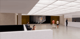
For the Cleveland Museum of Art, we designed a permanent digital display for the historic Breuer lobby—a 20-foot-wide screen that combines real-time content, bold visuals, and smooth motion to connect the museum’s architectural heritage with its forward-thinking vision.
brief
Our challenge was to create a display that feels contemporary while respecting the Breuer-designed space, delivering real-time updates, showcasing the collection, and welcoming visitors with visual clarity.
my Role
As Lead UI/UX Designer at Bluecadet, I led design direction and created a flexible system tailored to the museum’s content and space
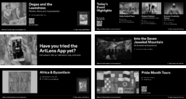
Wireframing for Dynamic Content
We used wireframes to define the information hierarchy and ensure the right content appeared in the right place, at the right scale. The wireframes helped us explore how the system could adapt to real-world scenarios—like shifting daily programs, variable text lengths, and image availability.
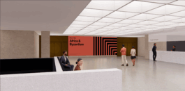
Direction 1: Architecture-Inspired
We presented two distinct design directions. The first drew from the building’s architecture, incorporating bold shapes and graphic patterns to create a strong, structured visual language that echoed the space’s materiality and geometry.

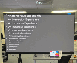
Direction 2: Immersive Perspective
The second direction focused on immersive perspectives—leveraging planes, layers, and dimensionality to evoke depth and movement, creating a more fluid and cinematic experience. Ultimately, the client chose a direction that blended elements of both approaches.

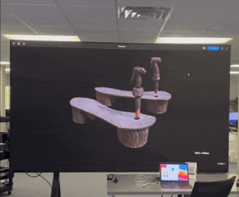
Scale Testing at Each Step
We tested content on a screen with the same resolution as the CMA wall to check how it would read at scale. 3D objects looked especially striking and felt like a strong opportunity for exploration. Text remained legible at a minimum of 30pt from 15–20 feet away, and QR codes scanned easily at that distance.
Final Design System
The final design system for CMA combined bold architectural references with spatial blur and 3D elements to create a cohesive visual language that felt both contemporary and rooted in the museum’s identity. Geometric patterns inspired by the building’s design were layered with depth and dimensional motion, resulting in content that felt dynamic yet balanced within the space.
Architecture Inspired Patterns
We continue to draw inspiration from the patterns found throughout the building—especially those within the lobby—while remaining mindful of visual accessibility and the overuse of stripes. For the Hero Exhibition Template, we developed five unique square-pattern animations that bring dynamic variety to the layout. Each one references and reinterprets elements of the ceiling architecture in its own way
Improving Content Clarity
Through iterative design, we refined text density, hierarchy, and pacing—ensuring that content felt approachable, scannable, and easy to digest in a public setting.
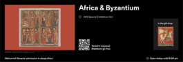
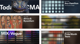
Showcasing Collection Diversity
The Collection Highlights template was designed to showcase the breadth and diversity of the museum’s collection through themed groupings. Each instance focuses on a specific theme and presents all related artworks together, while also spotlighting individual pieces within the theme for deeper engagement.
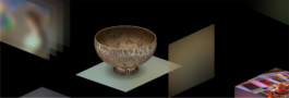
Showcasing 3D Artworks
To fully showcase the richness of 3D artworks, we designed templates that highlight their scale, texture, and intricate details. Each layout was crafted to let the objects stand out and take advantage of the display’s large format.
Team
Creative Director – Katie Savage
Lead Designer – Emily Lin
Lead Strategist – Nina Callaway
Lead Producer – Victoria Jones
Lead Developer – Adiel Fernandez
Senior Developer – Clay Tereck
Motion Designer – Devon Burgoyne
© Emily Lin 2026
Thanks for visiting ♥
© Emily Lin 2026
Thanks for visiting ♥