The Buffalo AKG Museum Website
2022
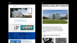
The Buffalo AKG Art Museum, known for its world-class modern and contemporary art collection, underwent a campus expansion and rebrand in 2023. I collaborated with the team to design a dynamic website that captures the museum’s refreshed identity.
brief
The challenge was to create a digital experience that captured the museum’s bold new identity while making its vast collection and programming more accessible to a broad audience.
my Role
As Lead UI/UX Designer at Bluecadet, I designed wireframes, layouts, templates, and brand-aligned components. I collaborated with strategists, developers, and stakeholders to ensure a cohesive, user-centered experience.
Translating Identity into Experience
We began with a comprehensive audit of the Buffalo AKG’s existing site to understand user behavior and content priorities. With a growing number of users accessing the site on mobile, we took a mobile-first, accessibility-focused approach. I designed new user experience functionalities to improve how visitors search and explore the museum’s collections and events, and created visual patterns that reflected the institution’s bold new brand across devices.
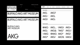
Integrating UX and Brand Identity
In addition to key UX enhancements that improved site navigation and usability, the design leverages the new brand’s typography and color palette to create a visually engaging experience. The challenge was to craft a site that reflects the museum’s contemporary identity while maintaining elegance and subtlety—ensuring the artwork remains the true focus.
Designing a More Intuitive Collection Search
With a collection of over 1.5 million works, the Buffalo AKG Art Museum offers one of the most significant holdings of modern and contemporary art. But navigating this collection—especially on mobile—had become overwhelming, with search results often buried or disorganized. To improve the user experience, I designed new search functionalities that made exploration faster and more intuitive. These included a “sort by type” filter and a unified global search that now surfaces artworks directly—eliminating the need for separate queries and making it easier for users to find what they’re looking for in fewer steps.
Structuring Content for Discovery
To support better exploration and internal structure, I helped organize content by type—pairing each with a tailored visual pattern. Events use a clean list view for easy scanning, while featured content is presented in a flexible grid that encourages browsing and engagement.
Dynamic Ways to Explore the Collection
To deepen engagement, I designed flexible collection views—like timelines—that reuse existing data to reveal context, support storytelling, and enhance exploration without added complexity.
Redesigned Site Header & Navigation
I redesigned the site header to incorporate the museum’s three distinct logo marks, ensuring flexible brand representation across different contexts. The header also improves site navigation with a clear, user-friendly layout and features a minimized state that appears when users scroll up—maximizing screen space while keeping navigation easily accessible.
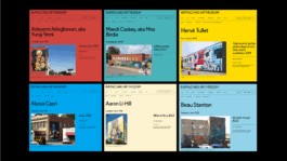
Flexible Color System
We developed a flexible color system that allows content authors to select custom background colors for exhibition pages. This capability enhances visual differentiation and aligns each exhibition’s presentation with its unique identity, creating a more vibrant and engaging user experience.
Team
Creative Director – Kim Quinn
Lead Designer – Emily Lin
Lead Producer – Ben Baker
Senior Developer – Shaun Baer
© Emily Lin 2026
Thanks for visiting ♥
© Emily Lin 2026
Thanks for visiting ♥